Figma Design Services for Websites, Apps & Product Teams
Clean, organised, on-brand Figma files — designed for real collaboration, easy handoff, and screens that hold up as your product grows.
Why Figma Is the Right Tool for Your Design Project
A lot of design problems aren’t really about talent — they’re about the file. Messy layers, no design system, inconsistent spacing, and components that don’t update properly all slow a project down long after the “design” part is technically finished. Figma solves most of that by design, but only if the person building the file actually uses it properly.
I design every project directly in Figma, using auto-layout, proper component structures, and shared styles from the very first screen. That means your file stays organised as it grows, developers can inspect exact specs without asking, and any designer who joins the project later can understand the structure immediately — instead of untangling someone else’s shortcuts.
Why Choose Me for Figma Design
I’ve built Figma files for everything from single landing pages to multi-page products with dozens of components, and I structure every project the same disciplined way: reusable components, a consistent type and colour system, and clearly named layers and frames. You’re not just getting screens — you’re getting a working design system that scales.
You’ll be added directly to the Figma file as work progresses, so you can leave comments, track changes, and see the design evolve in real time rather than waiting for a big reveal. And because the file is built cleanly from the start, handing it to your developers — or to another designer down the line — doesn’t require a clean-up pass first.
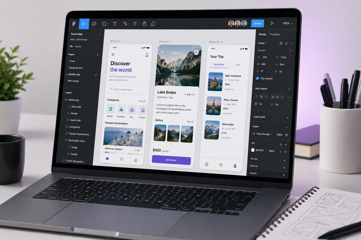
Full control, built around you
What's Included
Custom Component Library
Buttons, cards, forms, and navigation built as reusable components, so updates apply consistently across every screen.
Type & Colour System
A defined type scale and colour palette set up as shared styles, keeping your product visually consistent.
Auto-Layout Screens
Frames built with Figma's auto-layout so spacing and structure hold up when content changes.
Developer Handoff & Specs
Clean, well-named layers and inspectable specs so your developers can build without guessing measurements.
Real-Time Collaboration
Direct access to the working file, with comments and version history so you always see the latest state.
Post-Delivery Support
Minor adjustments and fixes after handoff, so small tweaks don't turn into a new project.
Ready to Start Your Figma Design Project?
Tell me what you need and I'll come back within 24 hours with honest advice and a clear quote.
Frequently Asked Questions About Figma Design
Figma allows real-time collaboration, a proper component system, and precise developer handoff — all in one tool, without needing separate apps for design, prototyping, and specs.
Yes. You’re added to the file as a collaborator from early on, and you receive full ownership of the final file once the project is complete.
Yes, this is core to how I work. Every project is built with reusable components and shared styles, whether it’s a single page or a full multi-page product.
Static, high-fidelity screens are the focus of this service. If you need clickable, interactive prototypes with animations for testing or demos, that’s covered under Figma Design Services & Prototypes.
Yes. If you already have brand guidelines, colours, or typography, I’ll build the Figma file around them rather than starting from scratch.
Timeline depends on the number of screens and whether a full component system is needed — most projects take one to four weeks. You’ll get a clear estimate with your quote.
Ready for a Figma File Your Team Will Actually Enjoy Working From
Whether you need a handful of screens or a full design system, I'll build it in Figma the right way — organised, consistent, and ready for your developers from day one. Tell me about your project and I'll come back within 24 hours with a clear quote.